Mathieu Opticiens Rebranding
A new vision
Mathieu Opticiens, a respected opticians business, wanted to mark a bold new vision for the future after 65 years of excellence. They wished to stand out in a market which has become saturated with similar identities and reaffirm their position as industry leaders.
Lemon delivered a creative redesign that perfectly balanced the long-established nature of the brand with innovation:
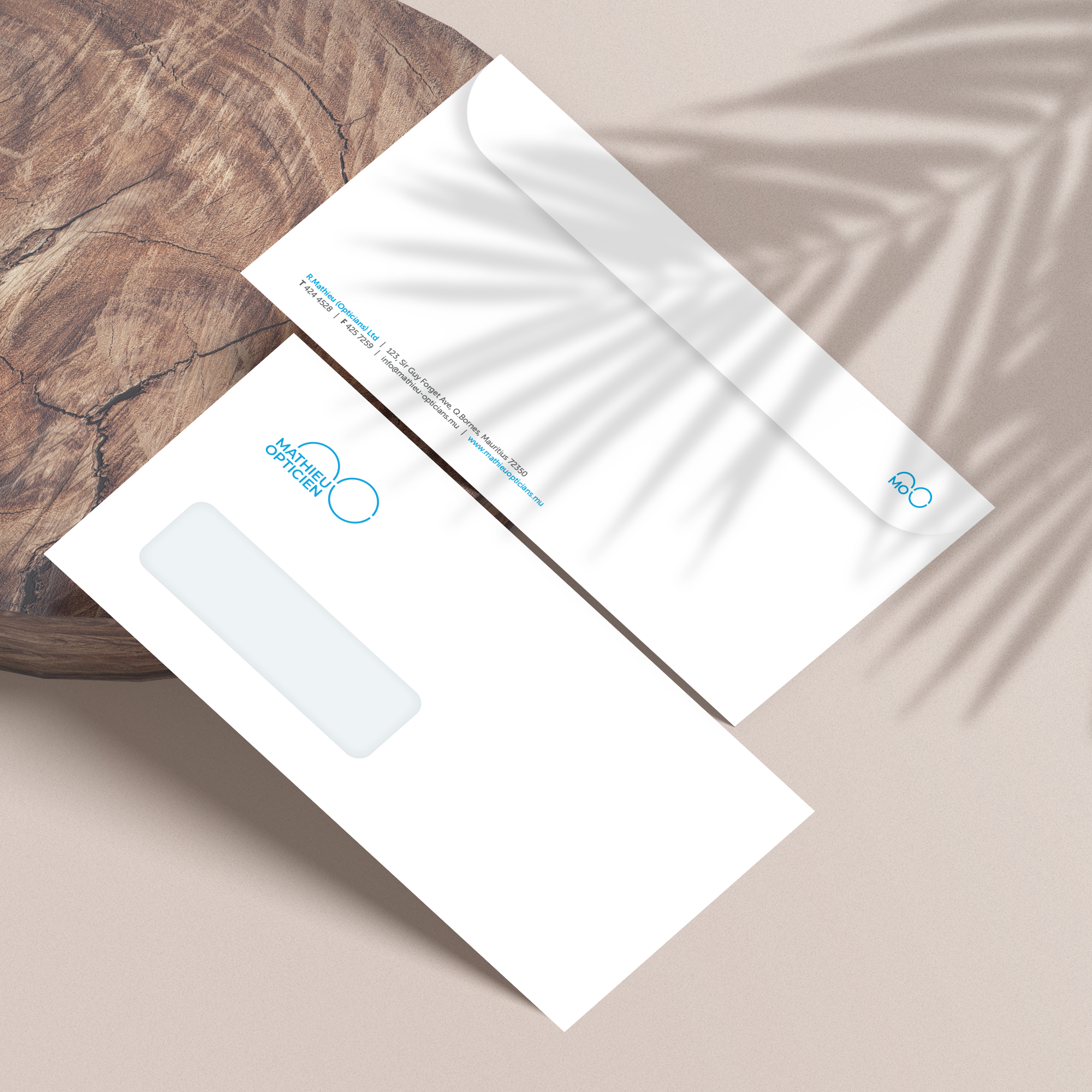
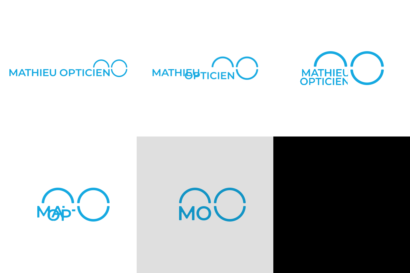
- A Symbolic Logo: the new logo features two circles symbolising eyesight and spectacles, a timeless tribute to the trade. The subtle ingenuity lies in the integration of the initials “M” and “O,” seamlessly weaving Mathieu Opticiens into the design.
- A Modernised Graphic Guidelines: the revamped brand identity is sleek, contemporary, and versatile reflecting Mathieu Opticiens’ expertise, history, and forward-thinking spirit.
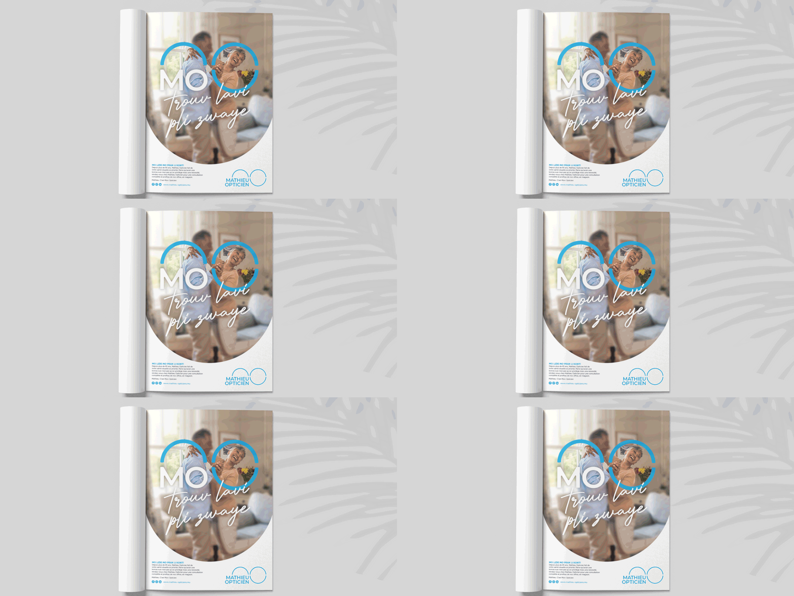
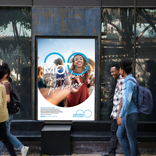
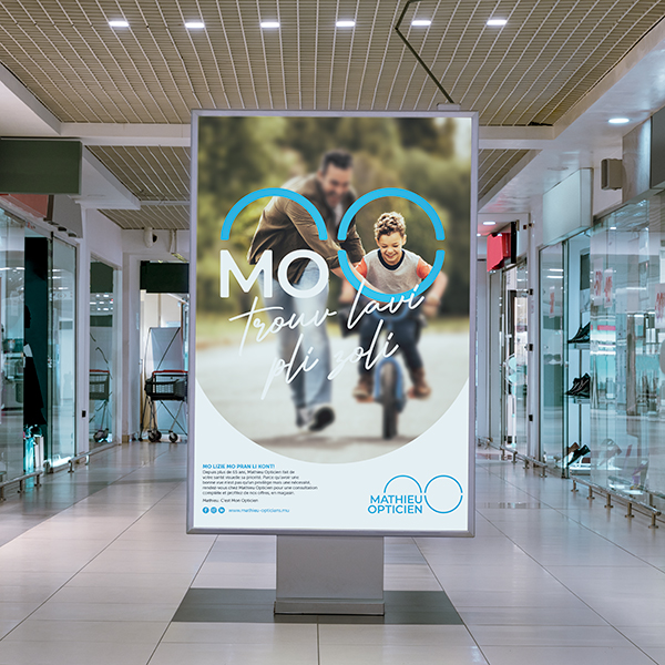
- Attention-Getting Advertising: Lemon also produced a fresh, dynamic look that separates the brand. Print advertising revealed the new logo while keeping the brand firmly at the forefront of the optical industry in Mauritius.